KKBOX Experience Revamp
When KKBOX completed its brand refresh, leadership's expectation for the product was clear but vague: the experience needed to match the new brand's spirit — fearless, curious, diverse — and give users a sense that KKBOX was moving forward. In practice, this was one of the most complex situations I'd navigated as a design lead. Years of accumulated features, pages updated at different cadences, and unresolved engineering debt had left the product in a state of visible inconsistency. My job wasn't to design a new homepage. It was to answer a harder question first: in a product with this much accumulated complexity, what's the right first move — and how do we make sure this doesn't fall apart? Rather than attempting to modernize everything at once, I focused the team on the single most visible entry point, made a deliberate bet on user experience over short-term commercial pressure, and structured the work so that what we shipped in Phase 1 could stand on its own while laying the groundwork for what came next.
The Problem
The brand refresh created a real expectation gap. From the outside, KKBOX had a new visual identity. From the inside, the product still looked and felt like something assembled over years without a unifying direction — because it had been.
At the start of the project, stakeholders had three genuinely different priorities:
Brand and marketing wanted the product to feel refreshed, to inherit the energy of the updated brand identity visually and experientially.
Engineering saw this as an opportunity to address years of accumulated technical debt — a legitimate need that had been deferred through multiple release cycles.
Design and product wanted to resolve the long-standing inconsistency between old and new UI patterns, which had made it increasingly difficult to design anything coherent.
All three were reasonable. The problem was that satisfying all of them simultaneously would have made the project's scope impossible to control. Without a forcing function, "Revamp" would expand to fill every gap anyone had ever wanted to fix — and deliver a fragmented result, or no result at all.
Before any design work began, I needed to answer a harder question: what was this revamp actually for?
I reframed the goal: given that we can't revamp everything at once, how do we create perceivable change for users at the most critical touchpoints while establishing a direction that future work can build on?
Finding the Focus
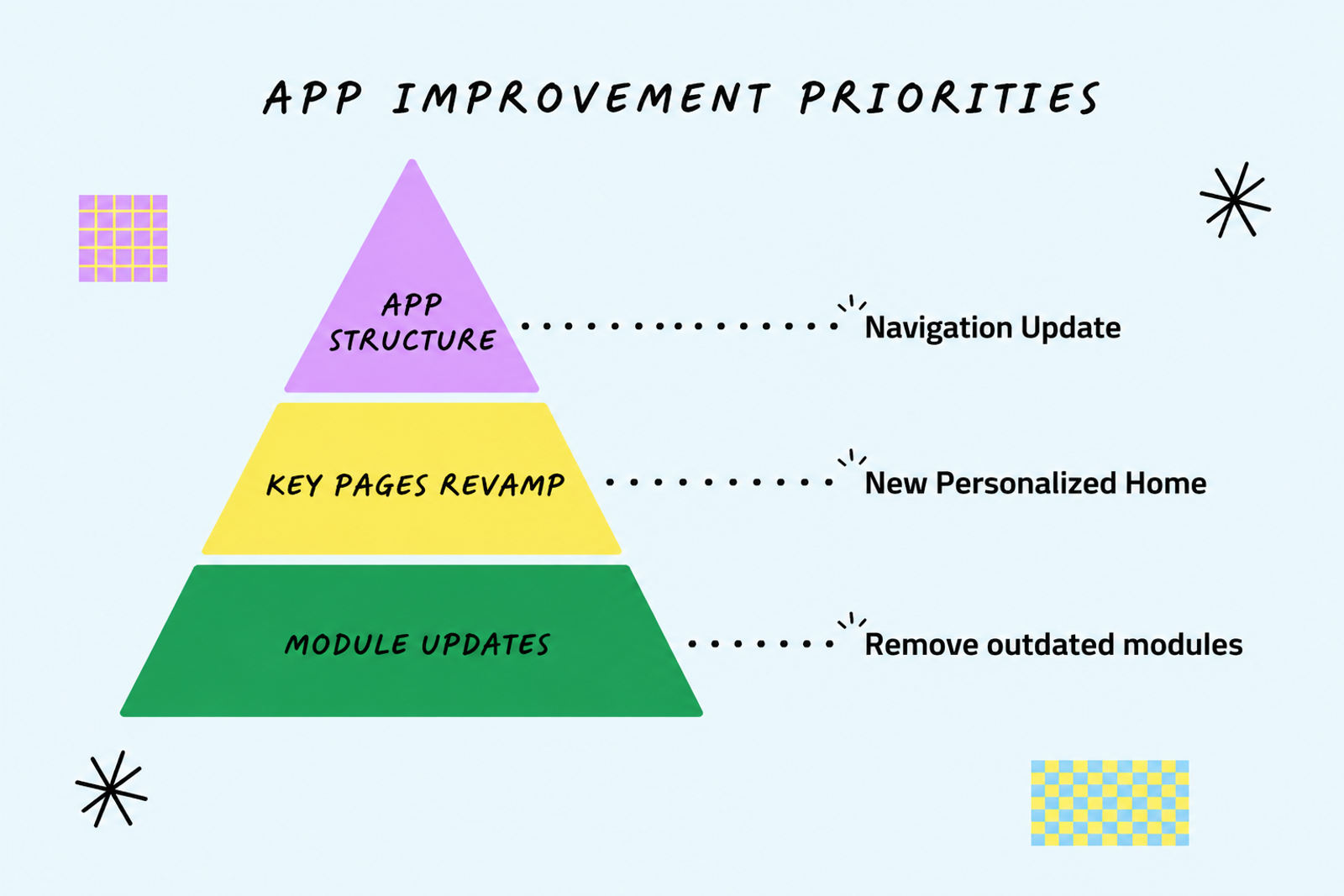
With multiple domains each presenting a reasonable case for priority (Discovery, Search, Player, Library), I needed a real framework for making the call.
I evaluated candidates against three criteria:
First touchpoint. Is this where users arrive when they open the product? High-traffic entry points create more leverage per unit of design effort.
Accumulated frustration. Has this area been criticized internally and externally, in ways that affect the overall impression of the product? Fixing high-visibility pain creates disproportionate goodwill.
Brand fit. Can this surface carry the values KKBOX wants to project — curiosity, personalization, discovery — in a way that feels authentic rather than applied?
The homepage scored on all three. It was the first thing users saw. It had been a source of internal dissatisfaction for years. And it was the surface most capable of communicating what the new KKBOX was about.
That analysis turned a multi-domain problem into a single primary bet. Everything else would need to wait.
Decision A — Homepage as the Entry Point
The decision to prioritize the homepage over other candidates was consequential in both directions.
Choosing it meant accepting that other domain revamps — Search, Player, Library — would be deferred. Teams working on those areas had legitimate projects they were excited about. Saying "not yet" to them required a clear rationale and enough organizational trust to hold that line.
It also meant accepting visible risk. The homepage is the first thing every user sees. A significant change to it creates the highest possible surface area for user backlash. A quieter change to Search or the Player would have been lower stakes. I chose the higher-stakes option because I believed it was the only way to actually move the product out of stagnation — and because a "safe" revamp that users don't notice isn't a revamp.
The trade I made consciously: scope discipline in exchange for meaningful impact.
Decision B — Experience First, Commercial Second
The most contested design decision in the new homepage wasn't aesthetic. It was structural.
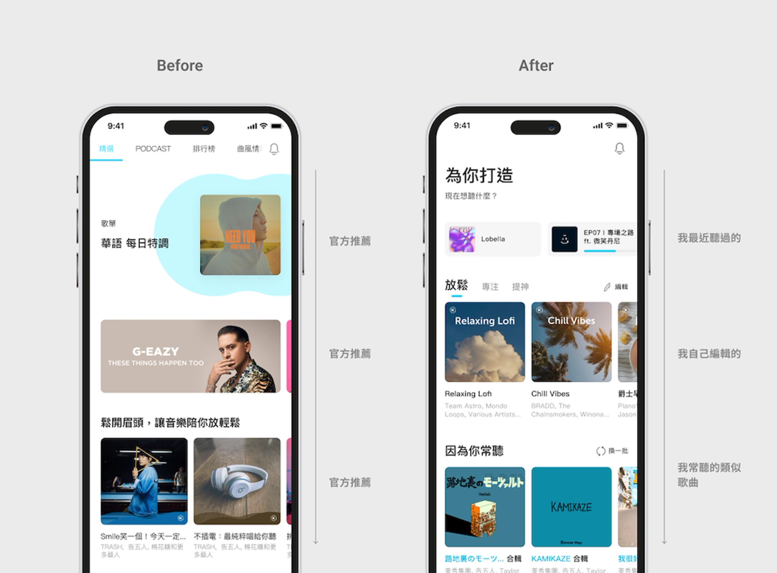
In the previous homepage, advertising placements and commercial modules were distributed throughout the main browsing experience. In the new design, I proposed consolidating commercial content onto a separate tab, keeping the primary homepage focused entirely on personalized discovery.
This was a bet with an obvious short-term risk: stakeholders who tracked commercial metrics would scrutinize whether the new layout was hurting performance. That conversation happened, and I knew it would.
My reasoning was direct: the new homepage's primary job was to get users into a listening state as quickly as possible. Personalized discovery — understanding who you are as a listener and surfacing what you'll want to hear next — was KKBOX's most defensible long-term advantage. Mixing that experience with advertising created a conflicting signal at the most critical moment of the user's session.
This was a decision I was confident about and willing to be wrong about publicly. If the data came back against it, I'd own that. But I believed the short-term commercial risk was worth taking to establish the product's experience direction.
Execution
With the direction established, I focused on three things during execution: rigorous discovery, visible progress, and a realistic phase structure.
Discovery. We ran a combination of data analysis, internal and external interviews, and a Design Sprint workshop that brought cross-functional stakeholders into the design process. It generated real input from people who understood different dimensions of the product, and it gave those stakeholders a sense of ownership in the direction. Both mattered when the design later faced internal scrutiny.
Staged communication. Because large revamps are vulnerable to becoming "black box" projects — six months of silence followed by a reveal that surprises everyone — I maintained a deliberate rhythm of interim outputs and upward communication throughout. Every key decision point got a write-up. Every phase had a defined deliverable. This wasn't just project management hygiene; it was how I maintained organizational trust in a project that had no guaranteed outcome.
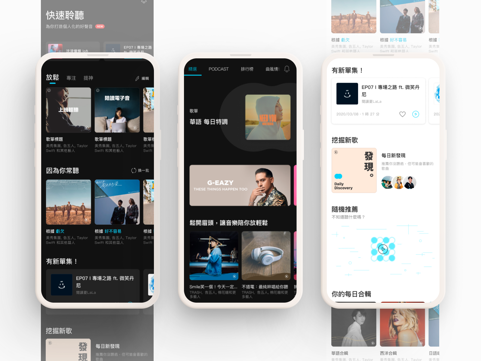
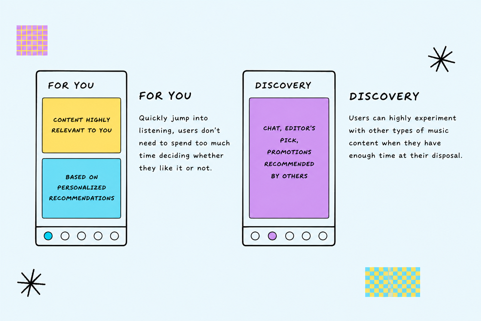
Phased delivery. Technical debt and emerging side requirements made a single-phase launch unrealistic. I made the call to split delivery into Phase 1 and Phase 2, with Phase 1 focused on establishing the product architecture and launching the dual homepage ("For You" and "Explore") as the foundation. This meant accepting that some of what we'd envisioned for the full revamp wouldn't ship immediately. But it also meant we'd ship something coherent rather than nothing.
Handling Pushback
When the new homepage became the default, some users pushed back. This was expected — changing a default experience always creates friction, regardless of whether the new experience is better.
My principle for navigating this was deliberate: distinguish between problems that block users from completing core tasks and problems that reflect users adapting to a new structure.
Issues in the first category — anything that interfered with finding or playing music — got fixed immediately, without debate. Issues in the second category got watched, measured, and held. They were monitored, measured, and held without being acted on impulsively.
We held the direction. The instinct to retreat to the old structure when users express discomfort is understandable, but it's also one of the ways products get stuck. I believed we'd made the right structural call, and the early retention data supported that belief.
Impact
The clearest signal came from user behavior rather than sentiment.
~5% of users who had previously used only My Library began entering the "For You" page to engage with personalized recommendations — a meaningful shift in a population that had self-selected into a more passive, archive-focused mode of using the product.
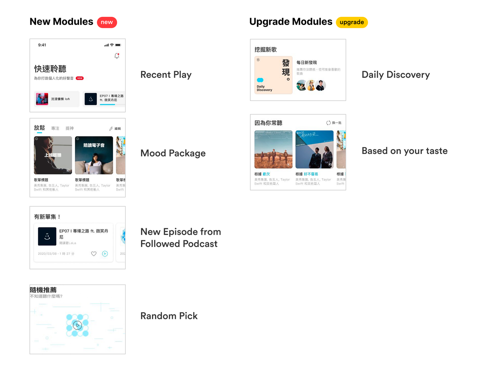
Users of the "For You" page, particularly the Recently Played module, showed notably higher retention than comparable users who hadn't engaged with the new homepage. The personalized discovery thesis was holding up in the data.
Qualitative feedback in periodic experience surveys and App Store reviews reflected positively on the new homepage — a signal that the experience was landing, not just being tolerated.
Beyond user metrics, the revamp established a product direction that the team could continue building toward. For a product that had been in a visibly inconsistent state for years, having a defined baseline — a "this is what KKBOX feels like now" — was itself a meaningful organizational outcome.
Reflection
The honest version of this project is that it lost momentum toward the end. Resources got pulled toward new proposals and the backlog of technical debt. Completing Phase 1 was the best realistic outcome, and I've made peace with that — but it's worth naming.
The lesson that stayed with me: the larger the revamp scope, the more critical it is to be explicit about what belongs to the short-term deliverable and what belongs to the long-term blueprint. On this project, I kept those two horizons somewhat blended in early conversations, which made it harder to manage expectations when Phase 2 got deprioritized. If I were starting over, I'd be more direct about the boundary between them from the beginning.
What I'd keep: the decision to scope down to the homepage, the commitment to experience over short-term commercial optimization, and the willingness to hold the direction through early user backlash. Those calls were right. The fact that the project didn't reach its full potential doesn't change that.
For a product that had been visibly stuck for years, completing Phase 1 and establishing a direction was the right outcome. The project didn't reach its full potential, but the product moved with our team’s efforts.